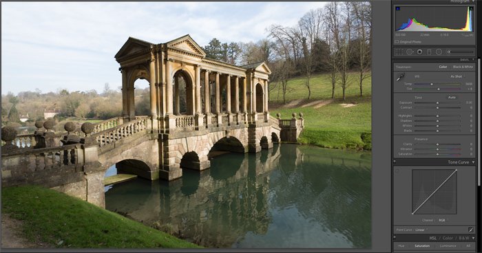
That’s why Adobe Lightroom includes a number of contrast and tone settings that you can use to adjust your photos. These settings can be used to create a variety of different effects, and it’s important to understand how they work. In this article, we’ll take a closer look the best Adobe Lightroom contrast and tone settings. We’ll explain what each setting does, and we’ll provide some tips on how to use them effectively.
Photoshop vs Lightroom Contrast Editing
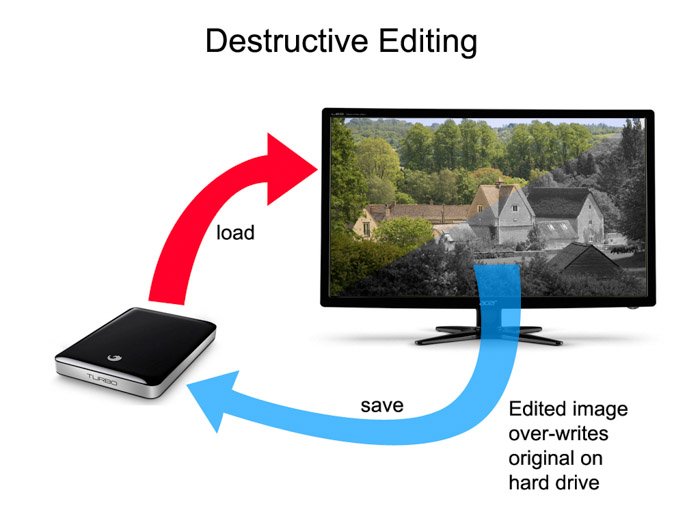
In Lightroom, you’re effectively seeing a simulation of your edits. This means you can make hundreds of edits to a photo and still revert to the original or any intermediate edit at any time. In Photoshop, saving an image results in the original being irreversibly changed. Using Lightroom allows you to process all the information your camera captured by working on the raw files it produces. You can also bring out details and enhance the image in ways that go beyond the in-camera processing automatically applied to JPEG images.
Histograms and Tone Controls
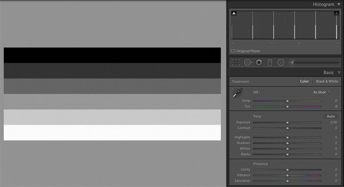
The histogram contains a lot of valuable data and knowing how to interpret it can help you quickly determine the state of health of each image. Suppose you were presented with a random mosaic of wall tiles ranging from dark grey through various shades of mid-grey to white as shown here: Now imagine you were able to remove each tile intact and then stack them in piles with the darkest tiles on the left and and the white tiles on the right. The arrangement would look something like this: In practice, each ’tile’ is a single pixel in the photograph. The resulting arrangement shows us the current distribution of tones in the image.
A Low Contrast Example
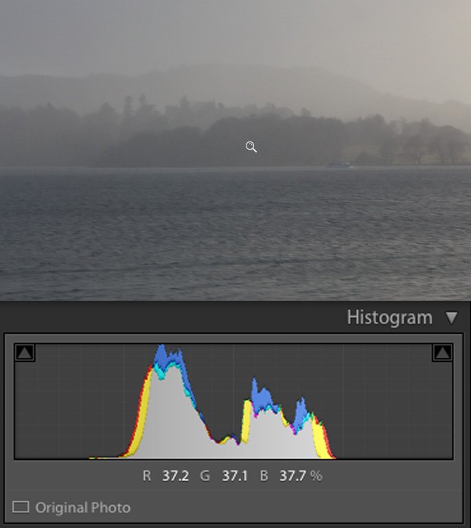
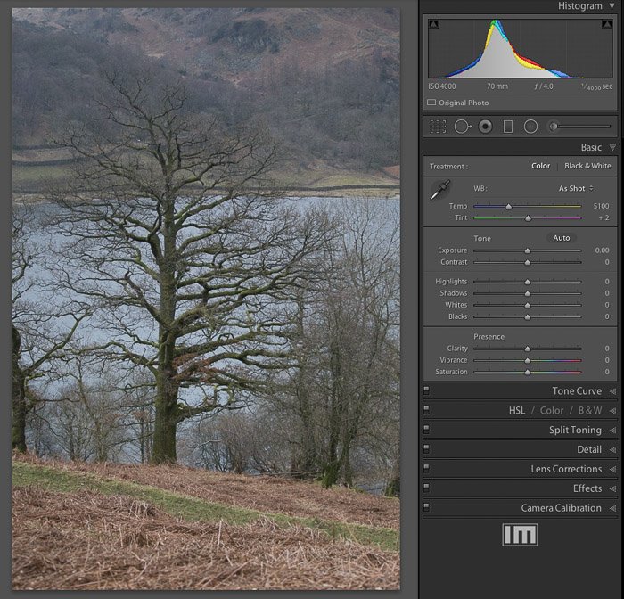
Most of the picture below is mid-grey and the histogram shows two main central peaks. The left-hand peak is generated by the darker band of trees across the lake and the dark patches on the water. The right-hand peak is from the sky, distant trees and the lighter patches on the water. This image is almost black-and-white but there is some warmer light trying to break through in the top-right corner. These slightly warmer highlights are generating the yellow fringe on the right-hand side of the histogram.
Brightness Levels
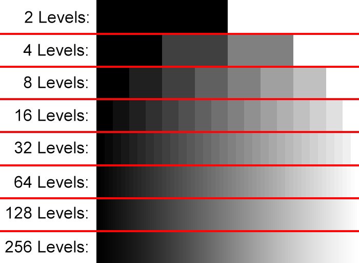
The above photo is an example of a low contrast image with no ‘punch’. In fact the ratio between the brightest and darkest pixels in this example (called the dynamic range), is less than 5:1. Your camera can probably capture a dynamic range of over 16,000:1. The Lightroom histogram only shows 256 levels because that’s all we need to display a quality smooth gradient from dark to light, shown here: The tone controls in Lightroom allow you to choose how the 16,000 levels get condensed down onto the 256 levels per primary color specified for JPEG images.
Using Tone Controls and the Histogram Together
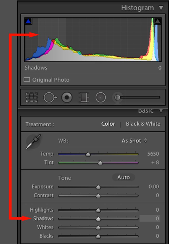
From the develop module, open the ‘Histogram’ and ‘Basic’ panels. Get into the habit of looking at the histogram and seeing how it relates to the displayed image. This is a raw image file and Lightroom has condensed the brightness levels down to fit a JPEG image (which is what you always see on screen). Each tone slider in the Basic panel control affects a specific tonal region. If you hover your mouse over the histogram, you’ll see a section of it highlighted together with the corresponding slider that affects it: As well as adjusting a slider, you can also directly click and drag a section of the histogram. Most people prefer to adjust the sliders and see the effect on the histogram as it’s easier to control.
Selecting the Right Tone Controls
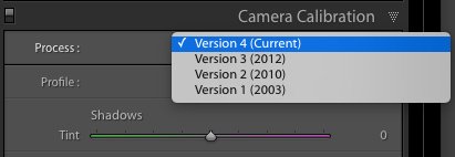
The standard tone sliders are: Exposure, Contrast, Highlights, Shadows, Whites and Blacks but earlier versions of Lightroom used Exposure, Recovery, Fill Light and Blacks. <img class=“aligncenter size-full wp-image-20364” src=“https://expertphotography.com/wp-content/uploads/2018/01/Adobe-Lightroom-Old-Tone-Control-Process-Sliders.jpg" alt=“The older tone control sliders in the Adobe Lightroom CC Develop Module” width=”618″ height=”314″ /> If you see these sliders instead of the expected controls, select the most recent process version from Process, under the Camera Calibration panel. After adjusting a slider, you can revert it to its default neutral position by double-clicking it. One way to reset the tone sliders is to right-click on the histogram and then select ‘Reset All’.
The Exposure Slider
This slider approximates the effect of changing the original exposure. But it doesn’t mimic the real-life effects of an exposure adjustment. In real life, if you were to increase the exposure value by one stop, the total amount of light gathered by the sensor would double. The numerical values of the pixels would also double. If Lightroom simulated this behaviour, the brighter areas of an image would quickly saturate. This is known as clipping. To avoid clipping highlights, the exposure slider mainly works on the mid-tones of your image. It makes smaller adjustments to the shadows and highlights. The overall effect is to brighten or darken the image. The exposure control is a fairly blunt instrument. If your exposure is obviously off by a stop or more, then it’s worth tweaking it with this slider.
Highlights and Shadows
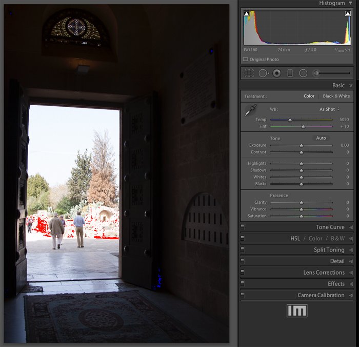
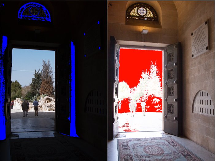
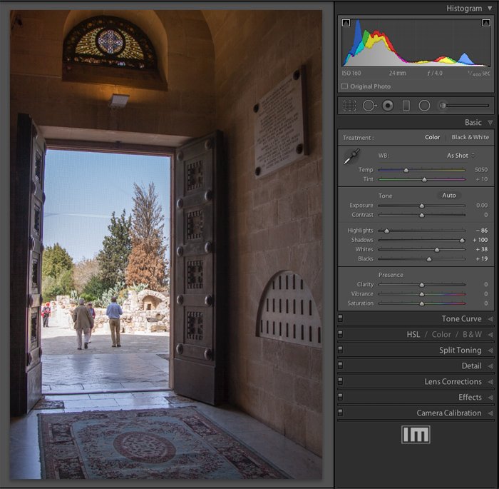
This high dynamic range image is typical of indoor photography on a bright day. The histogram shows most of the pixels are either very dark or very bright. With very few mid-tones, there’s little for the exposure slider to affect, so we use the Highlights and Shadows sliders instead. The red and blue pixels you can see in the image are not part of it. They are a warning overlay generated by Lightroom to alert you to a serious exposure problem. You can turn these warnings on or off by clicking on the triangles at the top-left and top-right corners of the histogram or by hitting the ‘J’ keyboard shortcut. If you can’t see these clipping triangles, right-click on the histogram and tick Show Clipping Indicators and Show Clipping. There is no single exposure in this example that would work for the whole image. Increasing the exposure might bring out detail in the otherwise dark interior but would burn out the exterior details. Reducing the exposure setting might help recover some details in the bright scene outside but render the interior a uniform black. Here’s the result of both exposure adjustments with the clipping indicators switched on: To fix an image like this, slide the highlights slider to the left and the shadows slider to the right. The red and blue pixels will disappear. The aim of this is to translate the tonal values of the pixels such that the histogram is more evenly spread between black and white. Here’s the resulting image and histogram after adjusting the Shadows and Highlights sliders. The histogram has a more even spread of tones and the image shows details not previously visible. It is also not crashing up against the left or right sides anymore.
The Black and White Sliders
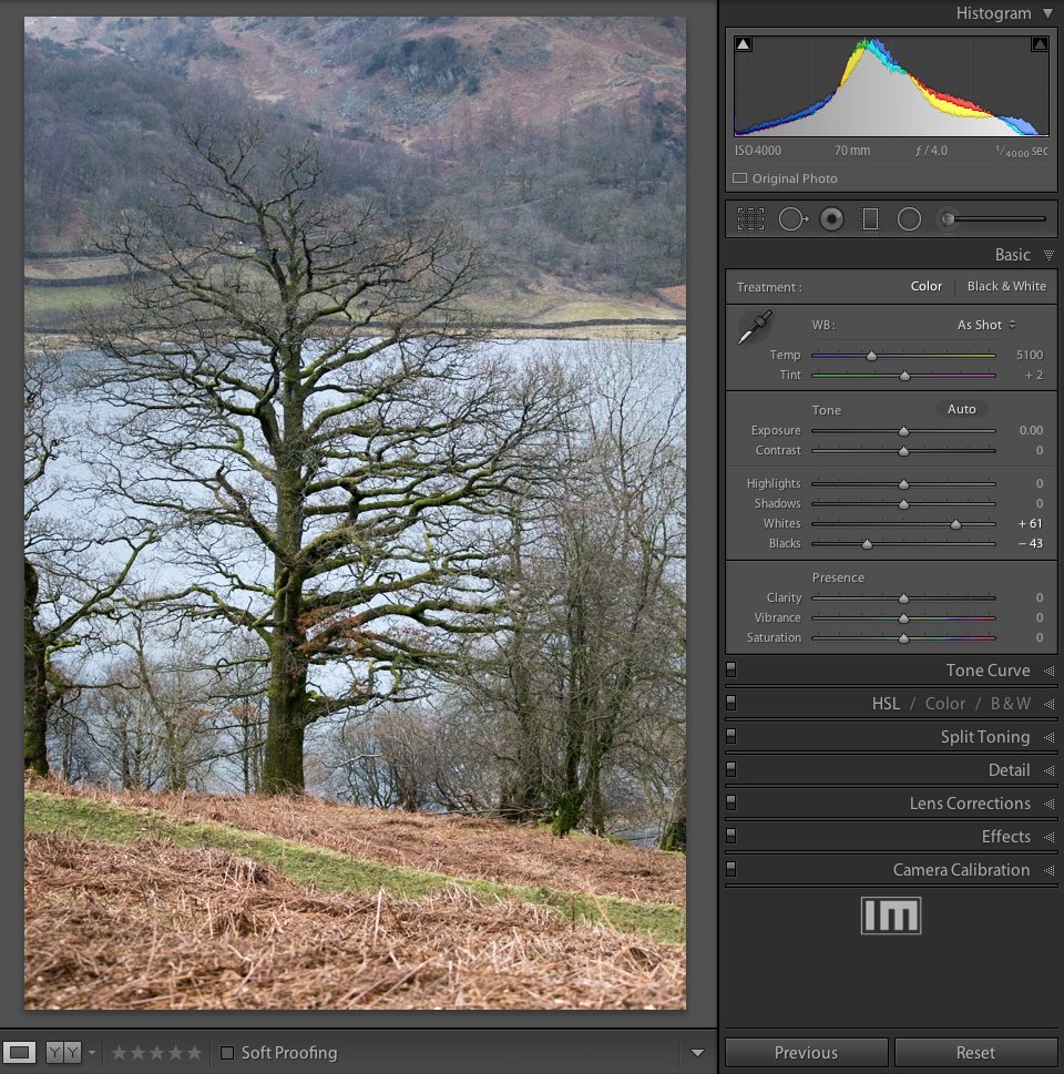
Not every photo has a pure black or white component but many benefit from having their tonal limits ‘pinned down’. This provides a reference point about for the shadows and highlight sliders. The process is easiest to see on a photograph that has a reasonable spread of tones but not quite enough to occupy the full tonal spectrum. Notice that the histogram doesn’t extend all the way to the left or right. This means there are no truly black or white pixels. Although the image might look OK at first, the histogram shows that it’s actually a bit ‘flat’. It would benefit from a boost to its dynamic range. The Blacks and Whites sliders allow us to set the black and white points. This will ensure the image has the maximum dynamic range which will in turn, make it ‘pop’.
Graphing the Black and White Points
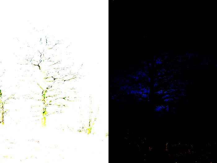
To set the black point graphically, hold down the ALT key while dragging the Blacks slider. The photo will be replaced by a blank white expanse. As you drag the Blacks slider toward the left, you’ll gradually begin to see the darker pixels appear as shown on the left half of the image below. These are the pixels that will become black. If you hold down the ALT key while dragging the Whites slider, you’ll see the brightest pixels begin to appear on a black background.
Pro-tip: Auto Black and White Points
A hidden feature allows the black and white points to be set automatically. Hold down the SHIFT key while double-clicking the word ‘Blacks’ next to the corresponding slider. Lightroom will then set the darkest pixels to black. And if you SHIFT double-click the word ‘Whites’, the brightest pixels will be mapped to the white point. The result is a stretched histogram and a more eye-catching image:
The Contrast Slider
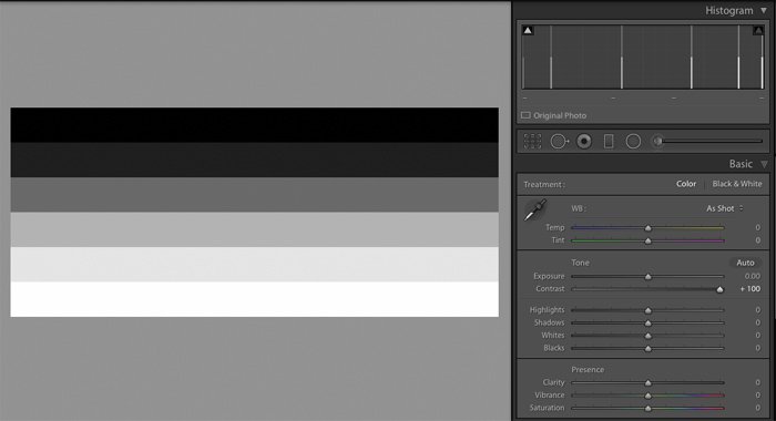
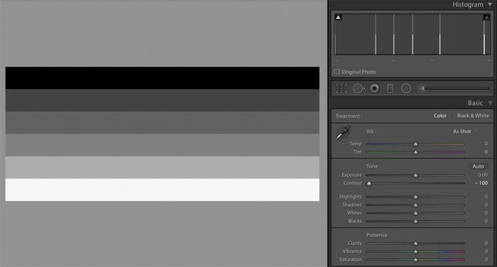
The contrast slider splits the tonal range down the middle and moves each half in opposite directions by varying amounts. When set to the mid-position, this control has no effect. But when you move it from its mid-position, it either stretches the histogram or compresses it. To see how this works, here’s a test image comprising six grey bands. Note that each level of grey produces a corresponding spike on the histogram and that these spikes are all evenly spaced. Setting the contrast slider to -100 increases the brightness of the darker tones and reduces the brightness of the lighter tones. This squashes the histogram into the center of the available tonal range and makes the image appear flat and dull in comparison. Use the contrast slider sparingly, reducing slightly for softer portraits or increasing for more ‘punch’. Watch the histogram or clipping warning indicators to avoid unintentional loss of detail.
Auto Optimize
Finally, if you want to quickly adjust all six sliders at once, just click the Auto button. Lightroom will analyse the image and set each control to what it thinks is the optimal value. It’s rarely perfect but it gives you a good starting point from which to experiment. The algorithm used to determine the slider values is better than it used to be. Adobe have also recently announced that tonal analysis is now the subject of machine learning based on neural networks. This should enable it to recognise certain types of photographs and suggest more accurate tonal adjustments. In our future articles, we will be showing you how post-process your photos using color temperature/presence, tolerance, and the various other tools available in the Develop Module. We also have a post on using the map module to check out next!

