12. Using the Rule of Thirds for Family Portraits
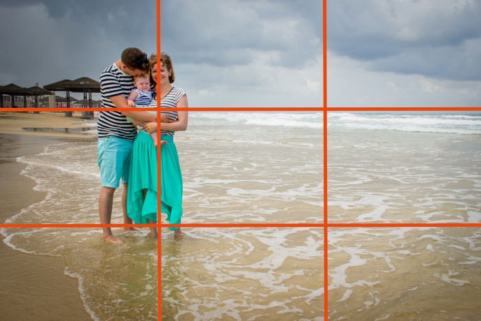
This is a classic composition guideline in photography. The rule of thirds helps us place our main subjects in the frame so that the photo looks natural and the viewer’s eyes are attracted to them. Imagine that your frame is divided by two horizontal lines and two vertical lines into nine equal rectangles. The rule of thirds says that you should place the key elements in the scene along these lines or in the points where they intersect. In fact, some cameras actually have a grid displayed when you look through the eye piece, to make it easier. In family portrait photography, one of the key elements of the image is the family. Play around and try to place the family on one of the lines. Experiment with it until you get a portrait composition that you like. This might not work so well with big families, because in order to place the family in one of the line, they need to really squeeze together. You could try placing the horizon on one of these lines in that case. And remember that even if the rule of thirds is a “rule”, you don’t have to follow it in all of your images. Use it only when it adds to your image.
11. Look for Symmetry
Using symmetry in your family portraits is an excellent way to break away from the rule of thirds. You can find symmetry in architectural elements where the family can stand, such as stairs or a bridge. In fact, the family members themselves can be part of the symmetry! You can use their reflections in water, glass or a mirror to create interesting and original portrait photography compositions, or place them one in front or across the other. It will work especially well if they are dressed similarly.
10. Frame the Family
Framing your family is a way to highlight that they are the main element in the image. It’s also a fun composition resource that will help you keep your creativity in shape! Look for natural frames in your environment, such as doors, bridges, trees, windows, etc.
9. Check Where You Place the Horizon
I mentioned placing the horizon according to the rule of thirds. However, that doesn’t mean you should follow it all the time! For example, I wouldn’t want the horizon to pass at the same height as people’s necks. It will look like their heads are separated from the rest of them. This “cut off” effect creates a feeling of discomfort which is worse than having the photo’s composition a bit out of balance. What you can do instead is place the horizon in the middle of the frame or really high, above their heads.
8. Leave Negative Space
Zooming in on the family is always a good way of framing the portrait. However, I also like doing exactly the opposite and leave a lot of empty space around them. This space is known as “negative space”. It is a way to keep the image simple and minimalist. It eliminates distractions and helps the viewer to focus on the important part of the image (in our case the family). But for it to work well, the negative space has to be relatively empty, which leads me to the next tip.
7. Avoid Distractions in the Background
When you take a family portrait there are a lot of things to pay attention to: correct exposure, light direction and the placement of the family members are just a few. It is quite easy to forget to take a look at the background and check that there are no distracting elements. You might end up with a garbage can right under the family or a crazy antenna coming out of their heads. It is a good habit to check the background quickly before pressing the shutter release and correct the composition of your image if you see something you don’t want to include. You might need to change your position or make the family move a bit, but believe me, it is totally worth it! This simple trick will save you tons of hours of post editing!
6. Add Leading Lines
The human eye likes to search for and follow lines. We can take advantage of this natural tendency when we take photos. If you have lines in the frame such as the outlines of a road or a building, use these lines can to lead and guide the viewer through the image to finally focus on your subject. Leading lines won’t always be this obvious though. More frequently they are environment components that seem like a line. You can use paths, walls, benches or even a wave breaker. Any line works. It can be straight, curved, diagonal, etc.
5. Change Your Perspective
Sometimes it is difficult to find a composition you like. Change your perspective. If you usually shoot facing straight, at eye level, you should try to move around and shoot from the side or lie down on the floor and shoot upwards. If you have something around for you to (safely) climb on to get a higher perspective, do it, and shoot from that height. If not, you can ask the family to sit down or crouch. Depending on the location of the photo session, you can even ask them to lie down. These alternative perspectives are good for adding diversity to the family photo collections as well as being an excellent way to eliminate distraction from the background. Is there a tree coming out of grandpa’s head? No problem! Move (or make your family move) until you find the perfect distraction-free background!
4. Not Everything Has to Be in the Frame
What you decide to include in or leave out of the frame is a personal decision. This concept changed my way of taking pictures because I realized that you don’t need to include everything in front of you. You are free to experiment and frame your photos in different ways, even with your own subjects. For example, when taking a group photo, toddlers can get overlooked because they are usually held by a much bigger person. In order to get the viewer’s attention on the kids, I sometimes partially crop out the adults. If you decide to crop out body parts though, take a look at the next tip first.
3. How to Crop for Better Compositions
When cropping, there are certain rules to follow not to give the viewer the feeling that the body part is incomplete. In general, it is not recommended to crop at the joints: wrists, elbows, knees etc. Just place the cropping point a bit higher or lower than these areas. Another tricky body part is the neck. If you crop the neck in half, it will seem like that person just lost their head and that is not nice. Crop at the chest instead.
2. Make Your Group Photos More Dynamic
If you want to convey the sense that the family is moving, you need to give them some empty space that they can move into. If the family is moving towards the left, leave some empty space on the right of the frame. Having them walk or move around is also a great option to avoid having your photos look too posed. You can also highlight where the family is coming from if you leave the empty space not in front but behind them. Leaving this space makes the images look more dynamic and interesting. Something similar happens with the direction they are looking in. If they are all looking towards the same direction and it is not straight towards the camera, leave some space that way. This will make the viewer wonder where and what the family is looking at.
1. Break the Rules
What we call composition rules should be considered more as guidelines than as rules. Although they are extremely useful, do not let them restrict you. Composition techniques are meant to be helpful guidelines for you to use or to neglect in order to create interesting, memorable pictures which convey both events and emotions. Do not sacrifice capturing a special family moment in order to stick to a technical guideline.
Conclusion
I invite you to try these family photography ideas to start playing around with composition guidelines. It might require more thought at first, but soon you will integrate composition techniques into your workflow. And remember, master the guidelines in order to decide when it is good for you to use them and when you’d be better off breaking them.


title: “12 Best Composition Techniques For Family Portraits” ShowToc: true date: “2022-12-30” author: “Jennifer Reeve”
12. Using the Rule of Thirds for Family Portraits
This is a classic composition guideline in photography. The rule of thirds helps us place our main subjects in the frame so that the photo looks natural and the viewer’s eyes are attracted to them. Imagine that your frame is divided by two horizontal lines and two vertical lines into nine equal rectangles. The rule of thirds says that you should place the key elements in the scene along these lines or in the points where they intersect. In fact, some cameras actually have a grid displayed when you look through the eye piece, to make it easier. In family portrait photography, one of the key elements of the image is the family. Play around and try to place the family on one of the lines. Experiment with it until you get a portrait composition that you like. This might not work so well with big families, because in order to place the family in one of the line, they need to really squeeze together. You could try placing the horizon on one of these lines in that case. And remember that even if the rule of thirds is a “rule”, you don’t have to follow it in all of your images. Use it only when it adds to your image.
11. Look for Symmetry
Using symmetry in your family portraits is an excellent way to break away from the rule of thirds. You can find symmetry in architectural elements where the family can stand, such as stairs or a bridge. In fact, the family members themselves can be part of the symmetry! You can use their reflections in water, glass or a mirror to create interesting and original portrait photography compositions, or place them one in front or across the other. It will work especially well if they are dressed similarly.
10. Frame the Family
Framing your family is a way to highlight that they are the main element in the image. It’s also a fun composition resource that will help you keep your creativity in shape! Look for natural frames in your environment, such as doors, bridges, trees, windows, etc.
9. Check Where You Place the Horizon
I mentioned placing the horizon according to the rule of thirds. However, that doesn’t mean you should follow it all the time! For example, I wouldn’t want the horizon to pass at the same height as people’s necks. It will look like their heads are separated from the rest of them. This “cut off” effect creates a feeling of discomfort which is worse than having the photo’s composition a bit out of balance. What you can do instead is place the horizon in the middle of the frame or really high, above their heads.
8. Leave Negative Space
Zooming in on the family is always a good way of framing the portrait. However, I also like doing exactly the opposite and leave a lot of empty space around them. This space is known as “negative space”. It is a way to keep the image simple and minimalist. It eliminates distractions and helps the viewer to focus on the important part of the image (in our case the family). But for it to work well, the negative space has to be relatively empty, which leads me to the next tip.
7. Avoid Distractions in the Background
When you take a family portrait there are a lot of things to pay attention to: correct exposure, light direction and the placement of the family members are just a few. It is quite easy to forget to take a look at the background and check that there are no distracting elements. You might end up with a garbage can right under the family or a crazy antenna coming out of their heads. It is a good habit to check the background quickly before pressing the shutter release and correct the composition of your image if you see something you don’t want to include. You might need to change your position or make the family move a bit, but believe me, it is totally worth it! This simple trick will save you tons of hours of post editing!
6. Add Leading Lines
The human eye likes to search for and follow lines. We can take advantage of this natural tendency when we take photos. If you have lines in the frame such as the outlines of a road or a building, use these lines can to lead and guide the viewer through the image to finally focus on your subject. Leading lines won’t always be this obvious though. More frequently they are environment components that seem like a line. You can use paths, walls, benches or even a wave breaker. Any line works. It can be straight, curved, diagonal, etc.
5. Change Your Perspective
Sometimes it is difficult to find a composition you like. Change your perspective. If you usually shoot facing straight, at eye level, you should try to move around and shoot from the side or lie down on the floor and shoot upwards. If you have something around for you to (safely) climb on to get a higher perspective, do it, and shoot from that height. If not, you can ask the family to sit down or crouch. Depending on the location of the photo session, you can even ask them to lie down. These alternative perspectives are good for adding diversity to the family photo collections as well as being an excellent way to eliminate distraction from the background. Is there a tree coming out of grandpa’s head? No problem! Move (or make your family move) until you find the perfect distraction-free background!
4. Not Everything Has to Be in the Frame
What you decide to include in or leave out of the frame is a personal decision. This concept changed my way of taking pictures because I realized that you don’t need to include everything in front of you. You are free to experiment and frame your photos in different ways, even with your own subjects. For example, when taking a group photo, toddlers can get overlooked because they are usually held by a much bigger person. In order to get the viewer’s attention on the kids, I sometimes partially crop out the adults. If you decide to crop out body parts though, take a look at the next tip first.
3. How to Crop for Better Compositions
When cropping, there are certain rules to follow not to give the viewer the feeling that the body part is incomplete. In general, it is not recommended to crop at the joints: wrists, elbows, knees etc. Just place the cropping point a bit higher or lower than these areas. Another tricky body part is the neck. If you crop the neck in half, it will seem like that person just lost their head and that is not nice. Crop at the chest instead.
2. Make Your Group Photos More Dynamic
If you want to convey the sense that the family is moving, you need to give them some empty space that they can move into. If the family is moving towards the left, leave some empty space on the right of the frame. Having them walk or move around is also a great option to avoid having your photos look too posed. You can also highlight where the family is coming from if you leave the empty space not in front but behind them. Leaving this space makes the images look more dynamic and interesting. Something similar happens with the direction they are looking in. If they are all looking towards the same direction and it is not straight towards the camera, leave some space that way. This will make the viewer wonder where and what the family is looking at.
1. Break the Rules
What we call composition rules should be considered more as guidelines than as rules. Although they are extremely useful, do not let them restrict you. Composition techniques are meant to be helpful guidelines for you to use or to neglect in order to create interesting, memorable pictures which convey both events and emotions. Do not sacrifice capturing a special family moment in order to stick to a technical guideline.
Conclusion
I invite you to try these family photography ideas to start playing around with composition guidelines. It might require more thought at first, but soon you will integrate composition techniques into your workflow. And remember, master the guidelines in order to decide when it is good for you to use them and when you’d be better off breaking them.


